Shelfies Are the New Showroom!
Create a scroll-stopping beauty shelfie visual. Explore how static setups, lighting-led edits, and texture layering elevate your aesthetic skincare lineup.
07 Jul'25
By Niharika Paswan

Shelfies Are the New Showroom!
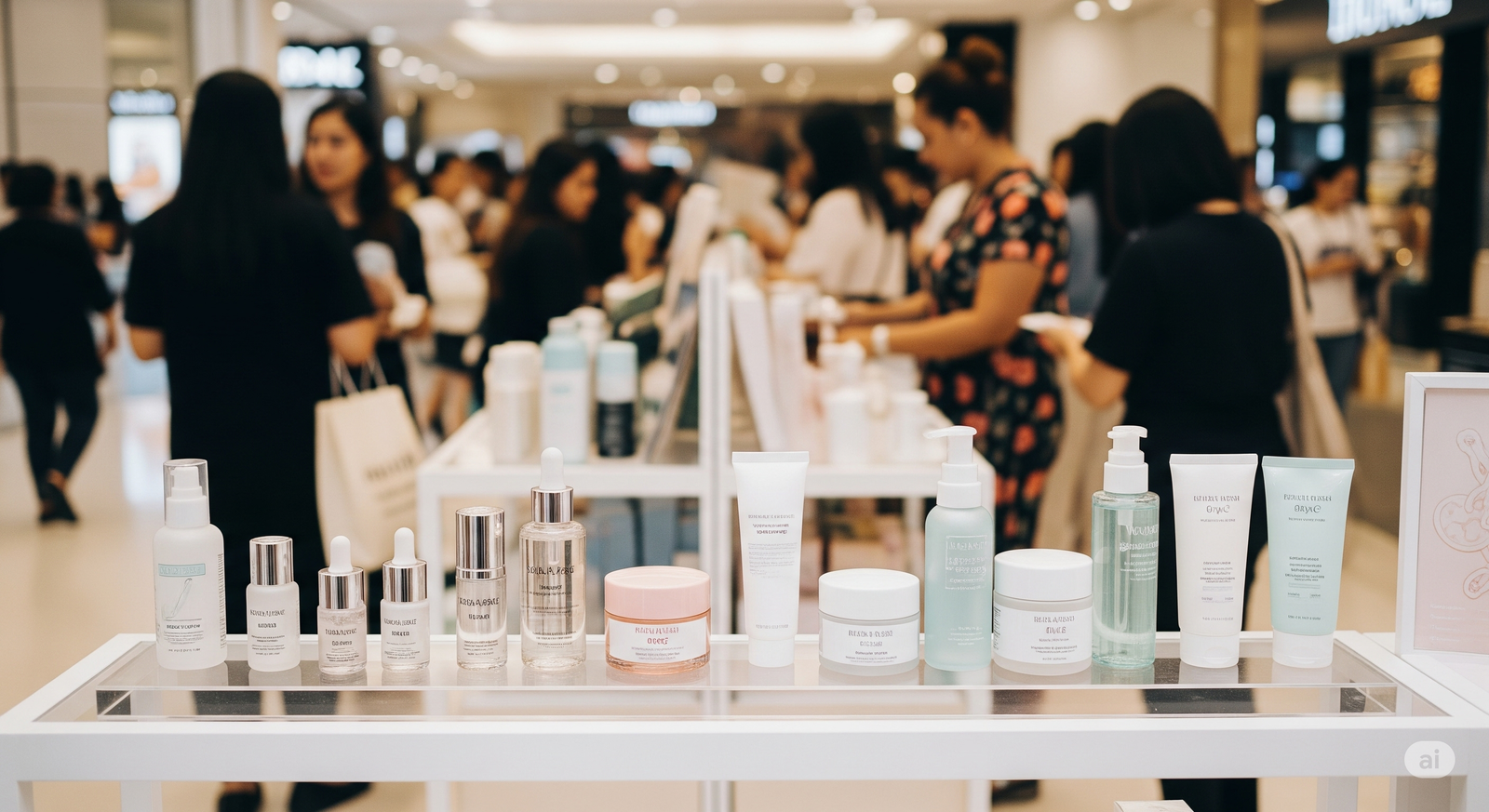
Before anyone touches your cleanser, before they know your claims, before a finger swatches that serum, they see your shelf. Not a physical retail one, but the digital shelf that lives on social feeds, bathroom counters, and bathroom-light glow-ups. It’s perfectly arranged, soft-lit, emotionally aspirational. Welcome to the era of the beauty shelfie visual.
Today’s shelf isn’t just a storage setup. It’s a branded billboard in disguise. It tells your audience who your customer is, what kind of lifestyle your product belongs to, and how that one bottle might fit into their everyday ritual. And when styled well, it becomes just as powerful as any full-blown campaign.
This is where brands win quietly but effectively. Aesthetic skincare lineups, strategically framed, can turn into saved posts, cart adds, and loyalty. Because shelfies don’t just show off, they signal. They say: this product isn’t just useful. It belongs.
Let’s break down why shelfies matter more than ever, and how to make static beauty arrangements feel like moving emotional moments with or without actual animation.
What a Shelfie Actually Sells

A shelfie sells presence. It shows a product that’s been chosen. That sits proudly. That clearly belongs. And that presence carries weight. It becomes the emotional entry point to everything your brand stands for.
Think about what a strong shelfie implies:
- The user has taste
- The product is part of a ritual
- The product works (because it’s visible, not hidden in a drawer)
- The lineup has a look, so the brand must have thought it through
When people scroll past a beautifully styled shelf, they don’t just see packaging, they see intention. And intention is what makes even the quietest products feel premium.
The Rise of the Static Beauty Flex
In a world dominated by reels and fast edits, the static image is making a subtle but powerful comeback. Why? Because stillness = confidence.
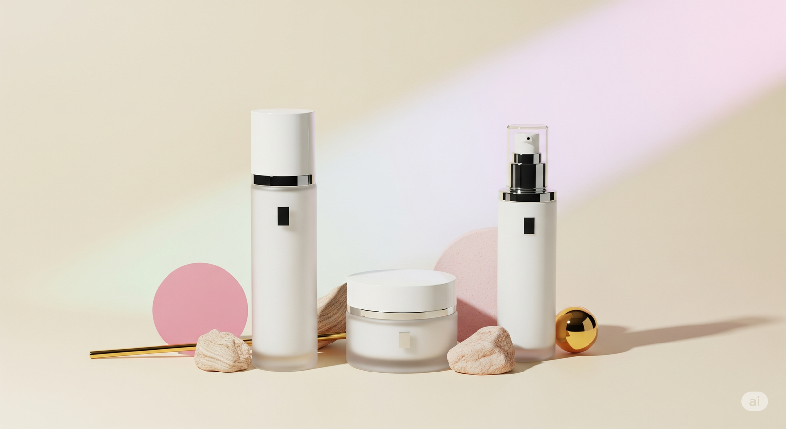
A clean, fixed shot of a bathroom shelf with soft natural light and neatly placed products lets the viewer do the imagining. No animation. No overlays. Just calm, quiet product presence. It feels:
- Honest
- Personal
- Aspirational in a low-pressure way
This is the lighting-led flex, where the glow comes not from camera effects, but from daylight catching the corner of a bottle. From glass gleaming gently next to ceramic trays. From the warm hue of wood against a cool-toned cleanser tube.
You don’t need product testers or dramatic wipes. You need presence, palette, and placement.
What Makes a Shelfie “Aesthetic”
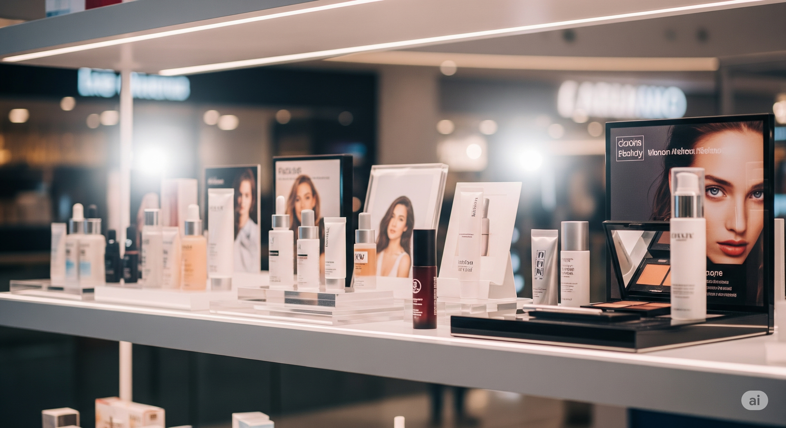
A great aesthetic skincare lineup isn’t about cramming every SKU into one frame. It’s about curation.
Here’s what makes shelfies work visually:
- Color harmony: The packaging tones should feel like a moodboard. Think neutrals and 1 soft accent, or monochrome with texture variety.
- Height variation: Mix bottles, tubes, jars, and droppers to create an effortless skyline effect.
- Texture layering: Add visual depth with clean cloth, stone trays, wooden risers, or small florals. Let the stillness feel lived-in.
- Light as styling: Shoot near a window. Let shadows play on the wall behind. Use light direction to guide the eye.
- Human echo: Add a pair of glasses, a silk scrunchie, or a used brush. These whisper that a real person uses this shelf.
When done right, a shelfie becomes an invitation. It says, this is what your life could feel like, if this lineup sat in your space too.
Texture Overlay Ideas That Add Depth
Shelfies don’t have to stay totally still. Even in post-editing or motion design, texture overlays can enhance a visual without overwhelming it.
Here are subtle ideas that preserve the stillness while adding mood:
- Soft light leaks: Mimic sunlight catching the lens with a slow glow pulse
- Dust float or mist haze: A barely-there movement across the frame adds dimension
- Shadow play: Animate the illusion of blinds or leaves casting a shadow
- Reflection ripple: Gentle movement on the shelf’s surface if shot on glass
- Satin cloth motion: Slight drift in background fabric (as if touched by air)
These animations work best when they’re invisible at first glance. The goal isn’t to distract, it’s to make the image feel alive. And that aliveness translates to a more emotionally resonant scroll experience.
Admigos Animates Clean Shelves With Depth
At Admigos, we build shelf stories. We don’t just style product, we choreograph stillness. Our team turns static beauty into living elegance through animation that respects the silence.
Whether it’s animating light shifts across minimalist bottles, casting slow shadows that deepen mood, or layering air textures to evoke freshness, we create depth without noise.
We know that sometimes, the most scroll-stopping shelfie doesn’t move fast, it just feels like it breathes.
The New Rules for Shelfie Content
If you’re styling your own content or briefing a creative team, here are the key things to remember for shelfies that actually convert:
1. Don’t overcrowd
Three products beautifully spaced say more than fifteen packed in. Let each product speak.
2. Pick a vibe, not a theme
Don’t just go “bathroom shelf.” Go “morning light on clean tile,” or “Sunday ritual in a linen robe.” Set emotional tone, not just visual subject.
3. Let texture talk
Pair matte tubes with ceramic dishes. Layer gloss bottles on marble. Think of each texture as a new paragraph in your shelf story.
4. Keep branding minimal
No bold CTA overlays. Maybe a soft watermark. Let your product be the message.
5. Shoot for softness
Even if your brand is high-performance, in a shelfie, lead with calm. This is where the product rests, not performs.
Shelfies as Part of the Customer Journey
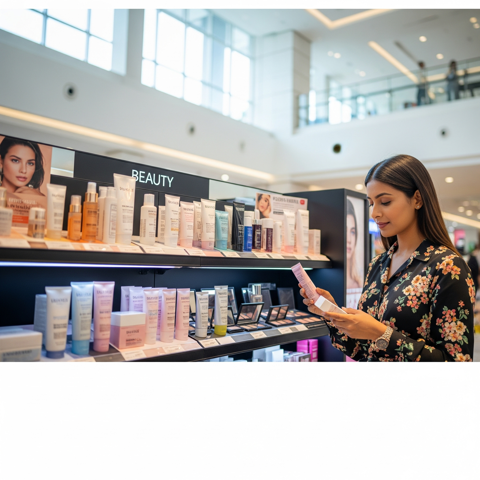
Shelfies aren’t just about social likes. They’re conversion previews. They show the product in-use, in-space, in-routine. It helps potential buyers answer:
- “Will this fit in my life?”
- “Does this product feel like me?”
- “Would I enjoy seeing this every day on my shelf?”
If the answer is YES, they’re already one step closer to clicking Buy.
The shelfie closes the gap between e-comm page and lived experience. And that’s where the magic happens.
Final Thought: Stillness Is Strategy
In an age of high-speed everything, a shelfie holds power precisely because it’s slow. It invites pause. It centers the product. It lets aesthetic speak louder than claims.
So treat your next shelf not like storage, but like a showroom. Let it hold light. Let it suggest rhythm. Let it whisper what your brand stands for.
Because that single static frame might just be the strongest brand story you’ve ever told.
— By Niharika Paswan
Minimalist, Glam, or Clean Girl? Decode Your Brand's Look
Decode your visual identity with minimalist beauty packaging, glam skincare visuals, and clean girl aesthetics. Build product edits that reflect your brand vibe.
What’s In the Bag? Why Bag-Spill Edits Convert
Bag spill content turns clutter into conversion. Learn how skincare in purse videos and zoom-out edits create intimate, real-feel beauty storytelling that sells.
